
Almost anyone who has spent time in the Lower Mainland is familiar with the free weekly Georgia Straight, sharing local news, cultural events, and sometimes controversial opinions. Since its radical beginnings in 1967, the newspaper has changed and evolved—including briefly changing names, redesigned logos, and adding new names to the masthead. It has also pushed back against societal norms (occasionally pushing too far) and fought for the rights of free press and free speech.
Some of these challenges would have caused a lesser paper to fold, but instead, the paper has become rooted in the local media landscape. This journey is depicted in the 50 year retrospective of covers in The Georgia Straight: A 50th Anniversary Celebration (Rocky Mountain Books) by Doug Sarti, with an introduction by Bob Geldof (yes, that Bob Geldof. Seriously, he used to write for the Straight).
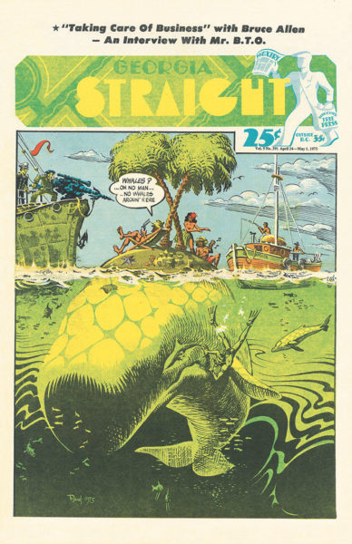
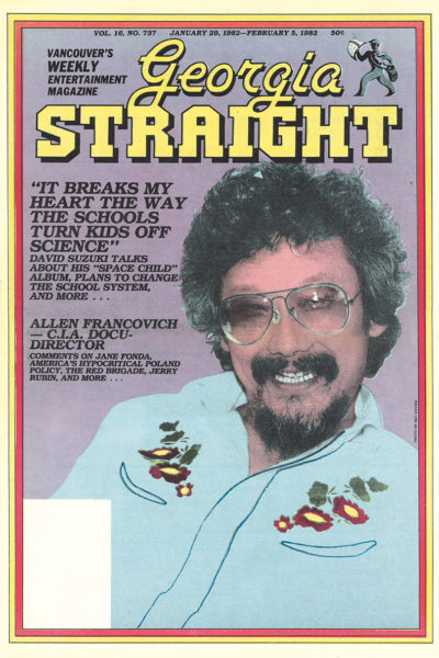
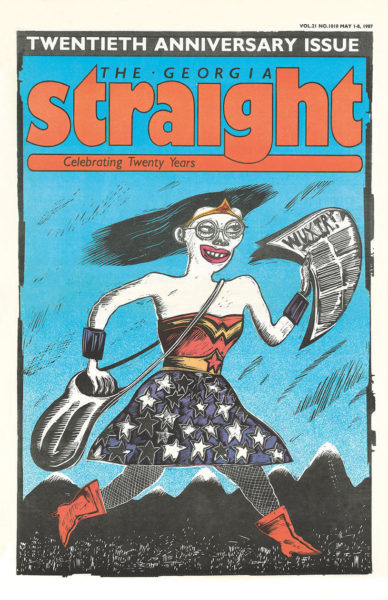
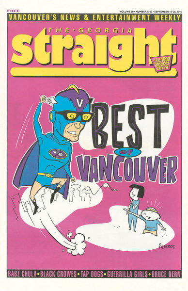
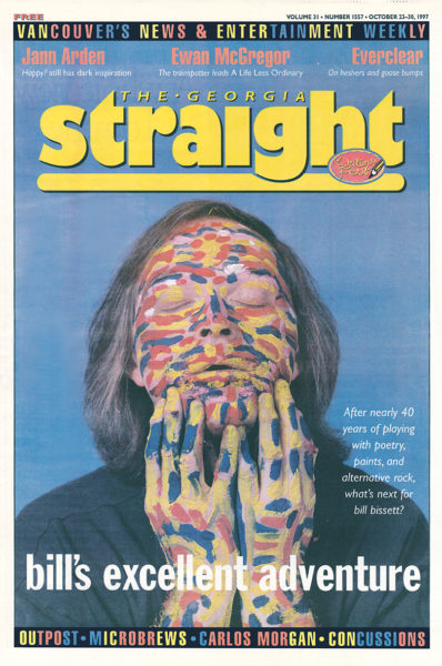
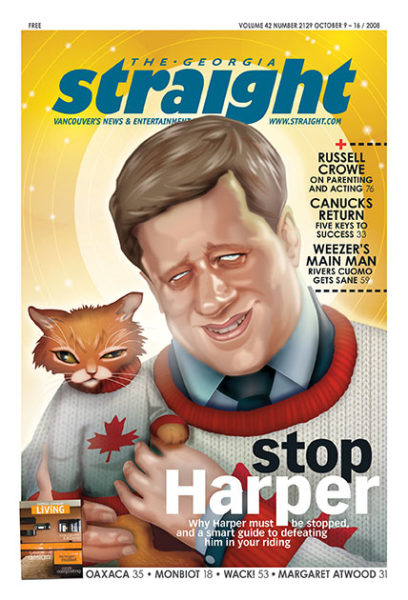
We’re excited to share a selection of Georgia Straight covers featured in the book. While known for hard-hitting journalism and opinionated prose, the Straight has also always been a purposely visual publication. The paper showcased a multitude of artists using various media and contrasting styles on the covers, while still delivering the important headlines—and it still does.
Also excerpted here the book’s prologue by Dan McLeod, owner and publisher of the Georgia Straight. As one of the paper’s founders, he’s been involved in all aspects of the Straight’s operation since its beginnings in 1967 and has long fought for the rights of a free press – even if it means taking on the police, judges or the provincial government.
[one_half]
[/one_half]
[one_half_last]
[/one_half_last]
Prologue by Dan McLeod
In 1967, long before it became a strip joint, the Cecil Hotel pub was a favourite gathering place for many UBC students, and I was one of them. The Student Union Building and its Pit Pub – as envisioned by zoology professor David Suzuki – were still in the early planning stages, and the Cecil was the only bar within seven miles of campus where a student could sit down with friends over a beer. And if you had a car, the parking lot in back was free.
Since then, the Cecil Hotel has been torn down, and in its place sits the Rolston, a modern, gentrified condo development, complete with a yoga and Pilates studio. But in February 1967, the name Georgia Straight was hatched at “the Cecil,” as it was fondly called, by two poets and two painters over a few beers.
Peter Auxier and myself were editors and publishers of TISH, a poetry magazine founded by some UBC English graduate students, including my freshman-year English professor and future first poet laureate of Canada, George Bowering. Michael Morris and Glenn Lewis were well-known local artists at the time who went on to international fame. But that night, Peter, Michael, Glenn and I were eager participants in a beer-fuelled game to name a new “underground” newspaper.
Our mission was urgent, because the first meeting to form the paper had just been held in an old rental house on Hamilton Street – soon to be known as “the Straight House” – and the consensus view of the “collective” was that the paper should be called Terminal City. The four of us all hated that name and its implied negativity, despite the positive historical connotations. I, for one, knew I could never work at a paper with that name. So we had to come up with an alternative before the next meeting, where the name was due to be finalized by majority vote.
[one_half]
[/one_half]
[one_half_last]
[/one_half_last]
Back at the Cecil, we all liked the idea of a geographical name, a permanent local landmark that evoked Vancouver but included the people beyond its borders. At one point, Glenn and Michael threw out the names of local bodies of water, such as the Pacific Ocean and the Georgia Strait and Juan de Fuca. I thought, “Yes, the Georgia Straight,” because we would be straight shooters, speaking truth to power. And, thinking ironically, in our lifestyle and beliefs we were anything but “straight.” That’s when I knew we had our name.
But we knew there would be fierce opposition to the name when we brought it to the next meeting of the collective. Terminal City was seen as a fitting tribute to the city where our national railroad terminated. I thought the name was boring and still didn’t like its negative undertone. Peter and I had to argue hard for the Georgia Straight, but eventually it was approved – just barely, after a bitter fight – by majority rule.
Anticipating the enormous difficulties entailed in launching a new newspaper, I also looked at the name as a great marketing tool because every local radio, television and daily newspaper weather forecast in those days talked at length about the forecast for the Georgia Strait, as recreational boating and commercial fishing and shipping were so important to the local economy. So the name of our newspaper was guaranteed to be mentioned – free of charge – several times a day by every single media outlet. Or so we thought. Soon the combination of radical thought and our resulting well-known name made us more famous than the body of water separating Vancouver Island from the Lower Mainland. And it didn’t take long for the local media to figure out that they’d been had. Here they were, giving free publicity to a radical 10-cent “hippie” weekly. Suddenly the forecasts for “gale warnings for the Georgia Strait” became “gale warnings for the inland waters.” Fortunately for us, the Georgia Straight had already taken its place in the popular imagination.
[one_half]
[/one_half]
[one_half_last]
[/one_half_last]
The Vancouver launch for The Georgia Straight: A 50th Anniversary Celebration will be held on Wednesday, September 27, at Book Warehouse Main Street. Pick up a copy of the book, hear some staffers speak, and celebrate the Straight. Doors open at 6:30; event starts at 7:00.